
Ultimate Guide to Black Friday Email Marketing
Part 3 - Design Examples
Winning Examples
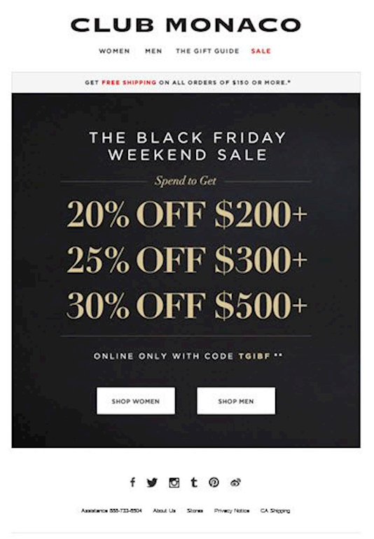
Why this works:
The content gets right down to business. There are clearly defined sales offers. Customer know exactly what to expect. Two CTA buttons are shown in high contrast for both target audiences.
Not So Winning Example:
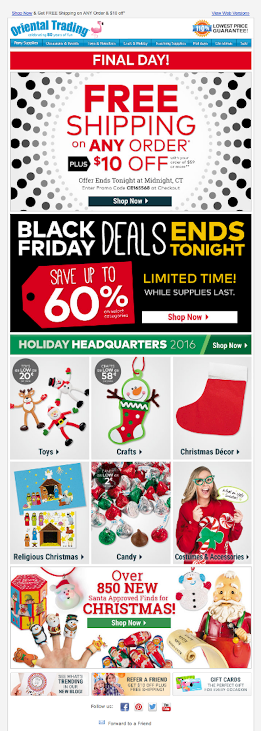
What went wrong:
This message seems to prioritize a free shipping offer over the Black Friday sale. They earn points for clear CTAs in the message, but lose points for a cluttered email. There a total of 4 CTAs scattered throughout the message. Does each 'Shop Now' button lead to different deals?
The concept here seems to be: this message has something for everyone. In practice, this strategy tends to fall flat in email marketing though it may work well in print media.
Segmented (targeted) delivery of messages will increase revenue. We would recommend avoiding this format. You will see higher returns breaking up the content such that each message focuses on single CTA. Secondary/Follow Up CTAs can be employed to further entice anyone still on the fence (e.g. read more) but the content should remain focused.